
As a new department formed within the Government of Canada, ASC uses research to revise and determine new accessibility standards within private sector organizations and Government of Canada departments and agencies. These standards help to prevent, identify and remove barriers to make an accessible Canada for everyone.


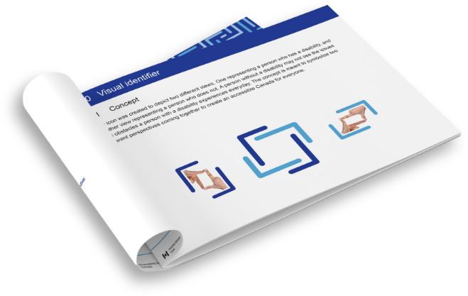
Just as an able-bodied person may not see the issues and obstacles that a person with disabilities experiences, an icon was created to depict two different perspectives. One frame of the icon represents the perspective of a person who has a disability, and the other representing the perspective of a person who does not. Having these two views coming together represents what inclusivity means to ASC.
Following Government of Canada brand regulations, the brand identity created for ASC was based on the icon above, and adapted into a pattern from the shapes used to make the icon. Combining the pattern with a minimal design aesthetic with bold contrasting colours made this brand pop.
To ensure brand consistency—from internal products to outsourced design work—a detailed brand guide was produced.
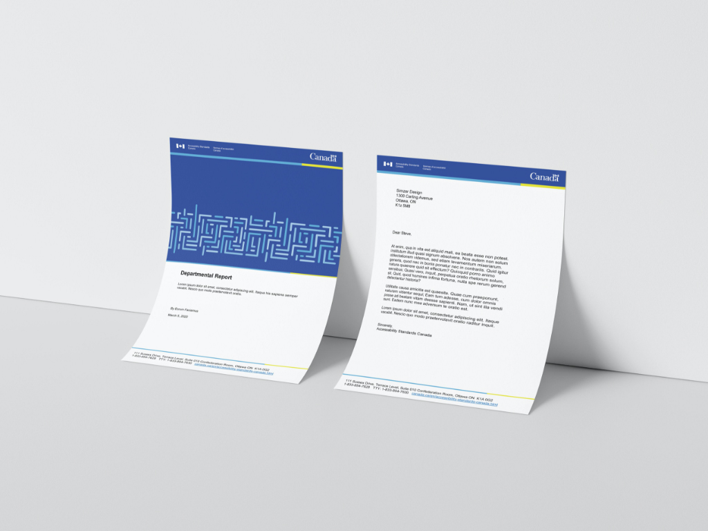

Following the development of the brand identity, an annual report was created to introduce the new look and feel. The chosen colours, fonts, icon, and pattern were used throughout the publication.
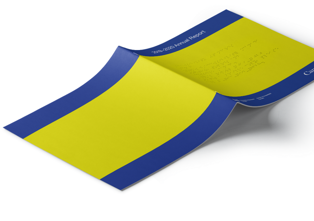
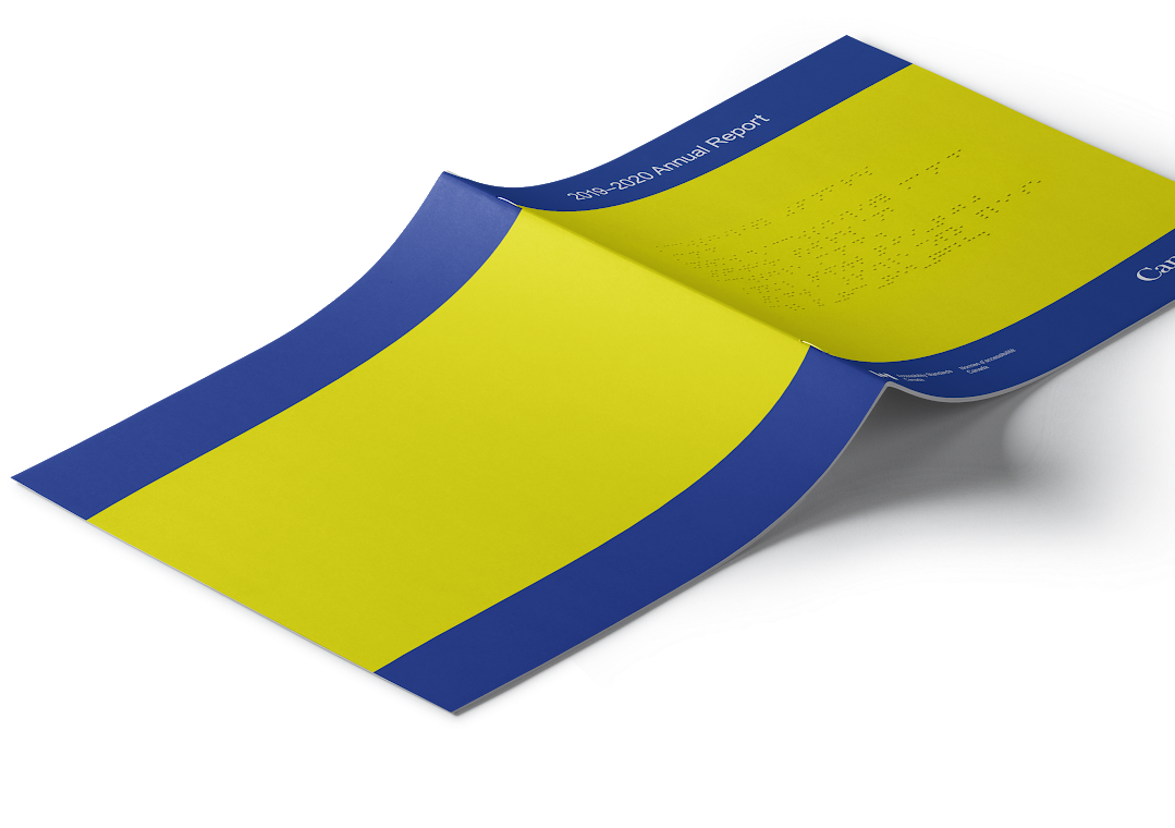
A braille cover was added to the annual report to inform visually impaired individuals that a braille version of the report is available upon request.
Following the development of the brand identity, an annual report was created to introduce the new look and feel. The chosen colours, fonts, icon, and pattern were used throughout the publication.
A braille cover was added to the annual report to inform visually impaired individuals that a braille version of the report is available upon request.
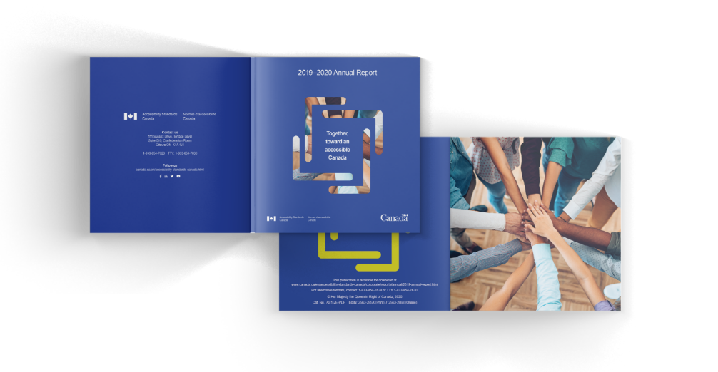
The main cover utilizes a custom die-cut of the icon, giving a glimpse of the image on the following page.
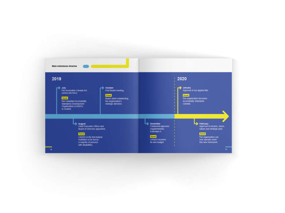
Brand elements were used throughout the annual report to highlight information in dynamic ways.
This brand was proudly designed for all to enjoy without compromise. All colours, patterns, and typography pass AAA WCAG Accessibility standards and follow AODA. This includes, but is not limited to, persons with low vision and colour blindness.