Representing over 2,000 municipalities, FCM creates and distributes various programs and tools which benefit these municipal governments and its citizens in many ways. FCM advocates for municipalities to be sure their citizens’ needs are reflected in federal policy and programs.

While FCM’s logo held a lot of brand equity, an evolution was needed in order to stay current. By simply adjusting the style of the maple leaf from its organic shape to a more modern style, we were able to evolve the logo while staying true to its integrity.
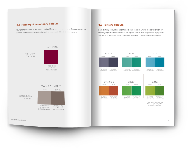
Following the logo update, a complete brand identity was developed. This identity reflects municipalities; a blending of their people, businesses, and ideas. A variety of curated colour blocks overlapping each other, conveyed the organization’s idea of convergence.
Throughout the brand development, the idea of convergence continued to be referenced by blocking text and overlapping graphic elements. In this style, custom iconography was created.
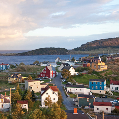
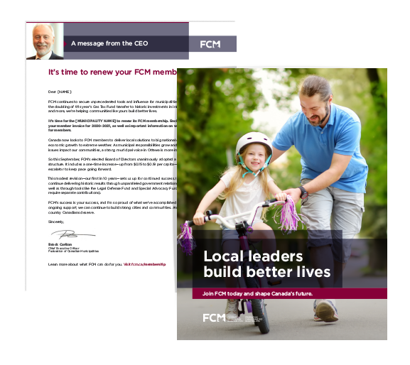
Photography style was established within the brand identity to ensure appropriate representation and diversity of Canadian municipalities.
A detailed brand guide was developed which outlines proper use of the brand identity, including, but not limited to, fonts, colour palette, convergence, photography style and icon use.

Using the brand guide ensures that all branded products, inside or out, can be clearly identified as FCM.
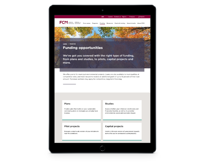
The flexibility of the brand identity allowed for the seamless integration into FCM’s website and online presence.